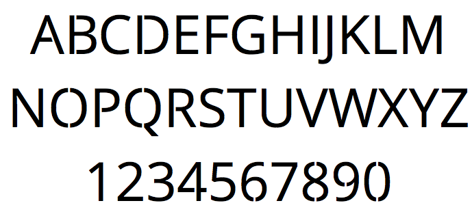
No Islands Sans - a sans serif font for cutting out and stenciling
TL;DR Go here to download the NoIslandsSans Truetype font
Using a standard font for a stencil seems like a good idea until you cut along the edges. You remember from preschool that the “islands” or inset areas will fall down and your “O”s will be a filled circle.
I came across this when trying to make a stencil for an LED matrix clock. The font I used was the gorgeous Helvetica Neue, yet cutting that out would lead to loose “A”a, “B”s, “D”s etc. so I painstakingly used Inkscape to “open” every of the 256 character outlines. That meant opening a bridge from the outside of the character to the inside. Worst of all: apart from copy&pasting single characters, none of the text editing helpers like centering would work.

A few years later, I needed to make a new stencil and said: "Screw it, I'll make a proper font." Editing a font is surprisingly easy with a little time, patience and the open-source software FontForge.
Using Helvetica Neue is not (legally) possible to modify (and redistribute), but using something under an open license is. So I looked at some alternatives and found two that seemed nice:
- Open Sans, which is published (and paid for) by Google under the Apache License version 2.0.
- Liberation Sans, which is published under the SIL Open Font License.
I went with Open Sans. The license allows derivative work to be published under the same license, so you can download NoIslandsSans from its own Github repository. Thanks to Steve Matteson, who designed the font, and Google for paying for it and then giving it away under a permissive license. I just hope Steve forgives me for cutting things away from his font...